World Graph
Jump to navigation
Jump to search
| This trait has not been fully evolved, thus making it a stub. You can help make it useful by expanding it. |
The World Graph is a data chart.
It displays the amounts of healthy, infected and dead population of the globe on a graph. On the left, there are blue, red, and grey squares that serve as the color code. You can use this to determine how many people are infected, although if you want to see more data, a better choice would be the Infection Spread Summary.
Gallery
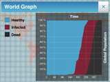
A world graph for a standard plague
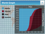
A Necroa Virus world graph
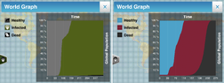
Simian Flu world graphs, showing both populations


